We are often asked by our clients, “How can we mix things up on our Instagram?” or “How can we get more local followers?” A great easy way to find organic content to post is reposting your salon’s stylists, or salon suites tenant’s work on your Instagram. It’s a win win. It’s easy, interesting, helps to promote your tenants and stylists services and best of all reposting is FREE!
How to RePost on Instagram
-Log Into your Instagram account
How to Re-Post 1. Download a RePost for Instagram App on your phone
-When you open the app watch the video on how to repost an Instagram post.
Here’s a brief overview
-Find a photo you want to Re-Post,
-Copy the link by pressing the three dots a top right of post -Go to the Repost It App, the post you want to share should load
-Click Repost
-This should add the post you want to Instagram
-Change the caption
Delete the automatic caption, and write your own caption, but leave the stylists Instagram tag @stylistinstagram. Be sure to tag the stylist!
-Add Hashtags (See Below)
5-GeoLocation Add the salon location to the post with the location marker symbol at the bottom of the post.
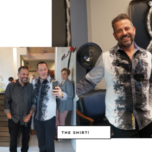
What to Repost? 1. RePost the stylists or beauty professional’s at your salon’s Instagram posts of their work (Please tag the stylist, compliment them, and use hashtags in your comments/ post text. Think win win!)
Hashtags – 20 per post
Hashtag Types to always include -Brand -Location -Service
1. Brand Hashtags #yourbrandname
2. Location Hashtags Examples for Atlanta #atlanta #atlhair #atlhairstylist #atlantahairstylist #atlantastylist #atlantahairsalon #atlantahairstyles #atlantahairstylist #atlantahair #atlweaves #atlwigs #atlbarber #altfacials #braidsatlanta #braidsatl #atlbraiders #atlantalashes #atlantamakeup #muaatlanta #atlmakeupartist #muaatlanta #makeupartistatlanta #atlantaskincare #atlantaskincarespecialist #atlskincare #atlantawaxing #atlmassage #atlmassagetherapist #atlmassagetherapy
Use location hashtags applicable to your business location only. Search in Instagram frequently by your location to find more or new hashtags. Example search #atlanta to find new hashtags. Also research which hashtags your salon suite owners/ tenants are using. ***Location hashtags are the most effective and most important to use. Location/ local hashtags will connect your Instagram post with locals using this hashtags.
3. Service Hashtags: Examples #balayage #rainbowhair #precisioncutting (Service hashtags will attract people nationally, not locally, so use sparingly.) *Pro Tip: Add all the hashtags you frequently use to your “Notes” app in your phone, so you can easily copy and paste into each new post.
Happy Instagramming! With Love, Social Butterfly Marketing